Where less becomes more, and space itself becomes nourishing
The Essence
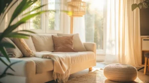
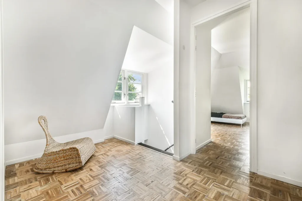
A particular calm arrives when a room holds only what it needs. Considered simplicity, where every element earns its place. Quiet Clarity lives in these rooms: spaces that breathe because they’re uncluttered, surfaces that speak because nothing competes for attention.
The Japanese concept of kanso (elegant simplicity) captures this sensibility. Remove what is unnecessary; what remains speaks clearly. In a healthy home, that clarity extends beyond the visual. It includes the air you breathe, free from the off-gassing of cluttered synthetic surfaces. It includes the quiet that natural materials bring, both acoustically and to the nervous system.
Quiet Clarity isn’t about deprivation or stark minimalism. It’s about making room for light, for breath, for the subtle beauty of a single material allowed to be itself.
Inspiration
Material Palette
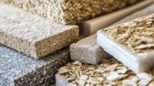
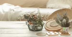
Quiet Clarity draws from materials that are honest about what they are. Surfaces that don’t pretend, don’t shout, don’t demand attention. These create the visual and sensory foundation.
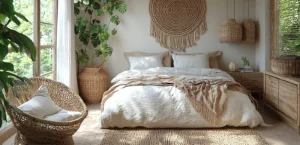
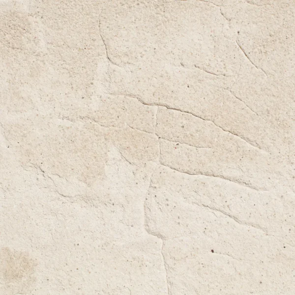
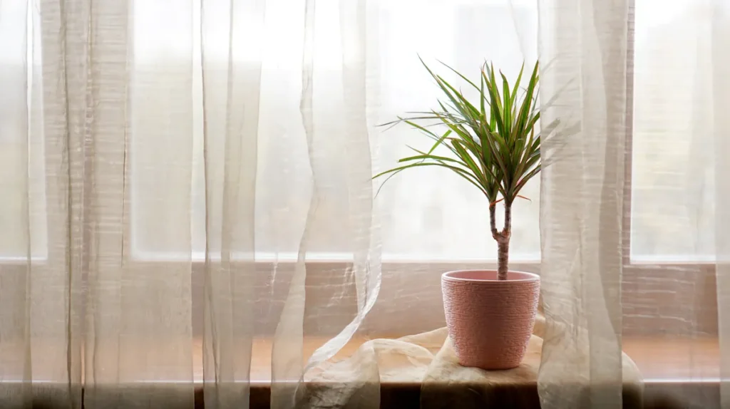
Lime plaster and limewash: The luminosity of lime creates walls with depth and life. Light penetrates the crystalline surface and returns with a gentle glow that flat paint cannot achieve. In pale tones (soft whites, barely-there greys), lime becomes a quiet presence that makes a room feel larger and cleaner than it is. When we first tested limewash on a north-facing bedroom wall, the surface caught and scattered even the grey light of an overcast afternoon. The room read brighter without any change to the lighting.
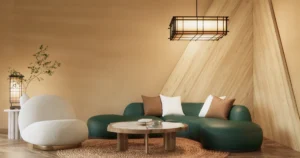
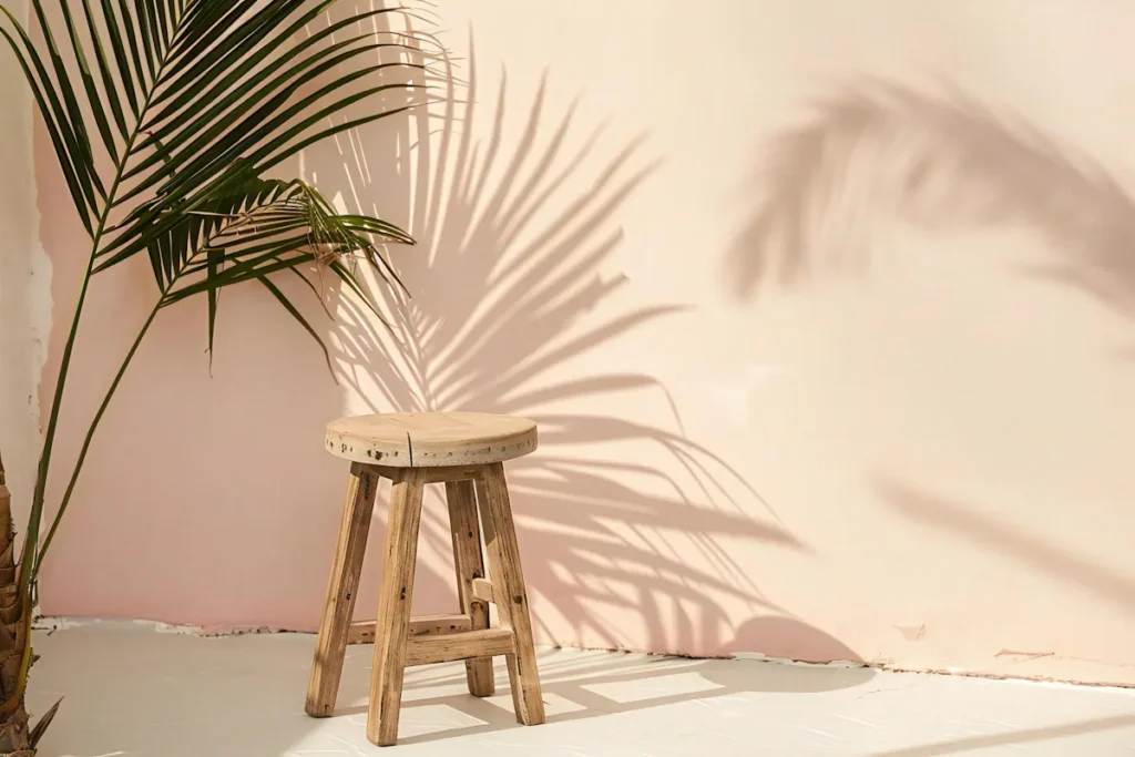
Clay paint: For a softer, more matte presence than lime. Clay’s warmth suits spaces that need grounding without weight. Natural pigments create colours that shift with the light, always alive, never flat.
Light-finished oak: Pale-oiled or limed oak flooring brings warmth without weight. The grain provides texture and interest, but in lighter finishes it doesn’t dominate. Each board is unique. The floor becomes a landscape.
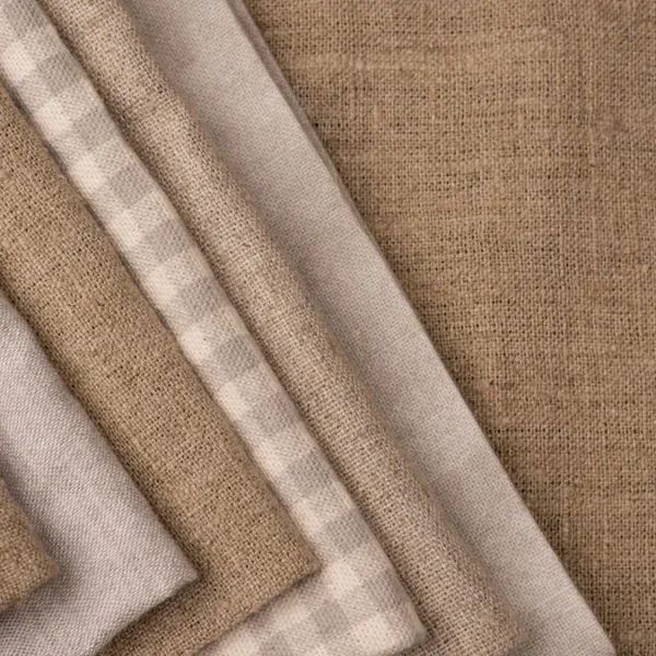
Linen: Undyed or pale linen for bedding, curtains, upholstery. The texture is present but gentle. Linen softens with use, developing a character that belongs to your life specifically.
Cork: Where underfoot warmth matters more than visual statement, pale cork provides cushioning and acoustic softening without visual complexity. It reads as neutral while feeling distinctly natural.
The Atmosphere
A Quiet Clarity space feels like taking a full breath. Visual calm translates directly to the nervous system, because when fewer surfaces compete for your attention, the mind stops scanning and the body begins to settle. Less to process. Spaciousness with purpose.
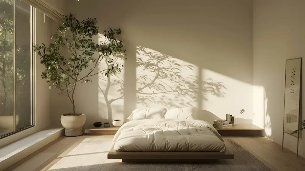
Light moves through these rooms differently. Without clutter to interrupt, sunlight travels across floors and walls, marking time in gentle progressions that you start to notice only after living with the simplicity for a while — the way a patch of warmth moves from the bedside table to the floor between breakfast and lunch. Shadows become part of the design. A room that changes with the day, the season, the weather. Alive.
The Japanese concept of ma (the space between) finds expression here. What is absent gives meaning to what remains. An empty corner is a decision to breathe.
Acoustically, these spaces tend toward softness. Natural materials absorb sound instead of bouncing it back. Conversations feel easier. Even silence feels cushioned.
How to Begin
You don’t arrive at Quiet Clarity by adding things. The process often starts with subtraction, noticing what doesn’t serve you, what clutters without contributing. But that’s gentler than it sounds.
Start with one surface. When you next repaint a room, choose a lime or clay finish in a soft, pale tone. This single change shifts the quality of light and air in the space. Live with it before deciding what else might change.
Clear one area completely. A single shelf, a corner, a tabletop. Let it stay empty for a week. Notice how your eye returns to it, how it creates rest in the visual field. If something earns its return, let it come back.
Consider the bedroom first. Quiet Clarity offers the most immediate benefit here. Clean air, soft surfaces, minimal visual stimulation: all support the rest your body needs. Linen bedding, clay walls, natural flooring. A sanctuary for sleep.
Trust natural light. Before adding lamps, see what daylight can do with simpler surroundings. Spaces that once felt dim may surprise you when less furniture and clutter absorb and block the light.
Common Questions
How do I achieve a minimalist look without the space feeling cold or sterile?
Focus on warmth in your material choices, not in quantity. A lime-plastered wall has depth and subtle texture that keeps a room feeling alive, even when furnishings are sparse. Natural materials like wood and linen carry inherent warmth that glass and steel don’t.
What’s the difference between lime plaster and clay paint for walls?
Lime plaster creates a luminous, crystalline surface that reflects light with depth. Clay paint gives a softer, more matte finish. Both are excellent for health and air quality. Lime suits spaces where you want brightness; clay suits spaces where you want grounding.
Is a minimalist approach more expensive?
Not necessarily. You’re buying fewer things but choosing better quality. A single lime-washed wall and a solid wood floor can be the entire foundation. Where you save on objects, you invest in surfaces that last decades.
Where should I start if my home currently feels cluttered?
Pick one surface or one corner. When you next repaint a room, choose a lime or clay finish. Live with it before deciding what comes next. The shift happens gradually, and each small change builds on the last.